Well, with back to school just around the corner (or you may well have been back already for a couple of weeks!), we’re hope you’re all prepared for the new school year. This time of year we’re super busy with our popular school name labels. Hopefully, many of you will have seen some of the brand new designs we’ve launched this year, and we’ve included some of our absolute favourites below.
The vast majority of our designs are created in-house by our wonderful creative team. We thought it might be interesting to take a closer look into the process our team goes through when creating these new designs.
So for this year, we started thinking about our new designs in January. This starts with creating a list of design ideas and themes we might like to create and where we think there are new trends that we don’t currently offer a design for, or where we think we can improve our current designs. This list is always SUPER long and so inevitably gets whittled down to a selected priority list that we focus on.
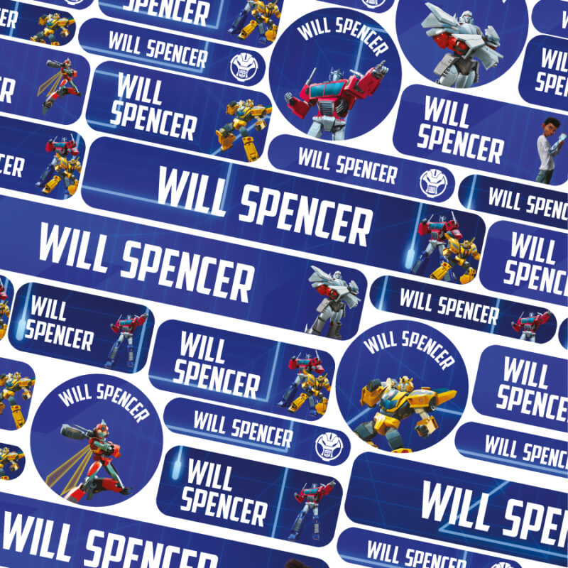
This year, Georgie from our creative team worked on all the new name label designs we created. Her arts background is perfect for pairing colourways together and creating a truly harmonious design, from matching colours, to adding details and then finding suitable typography and fonts. We have also worked with a number of external brands this year including Transformers, Nerf, Peppa Pig and Emoji to also expand our collection with well known children’s brands. We chatted to Georgie to hear about some of her inspiration for the new designs this year.
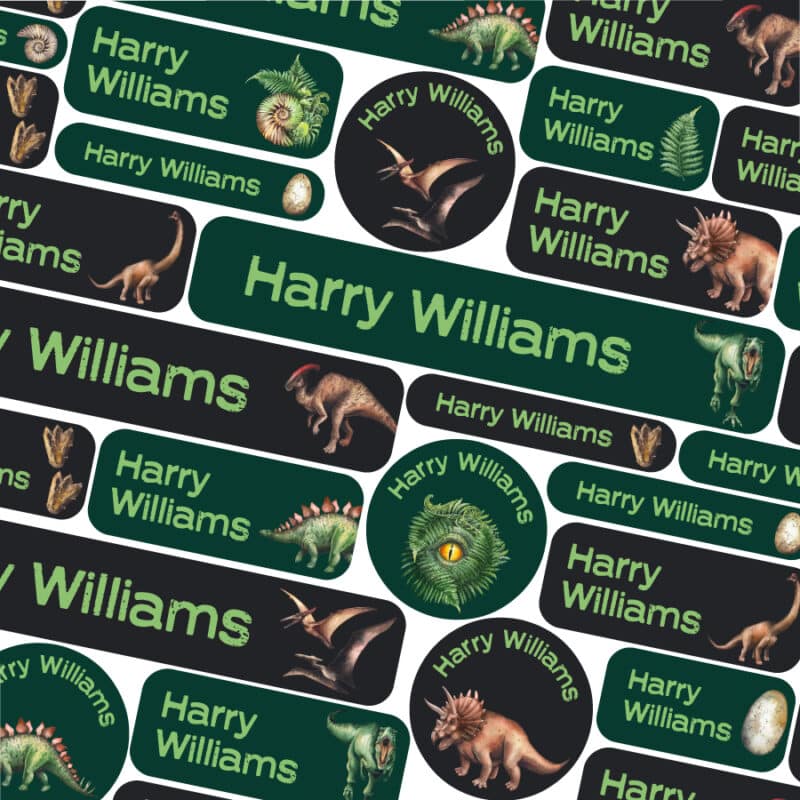
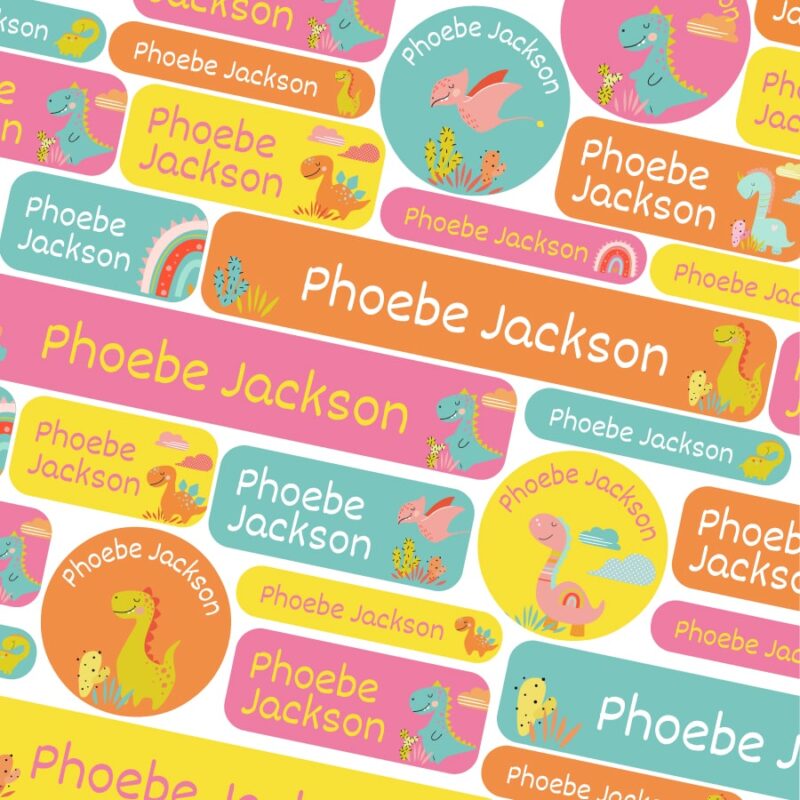
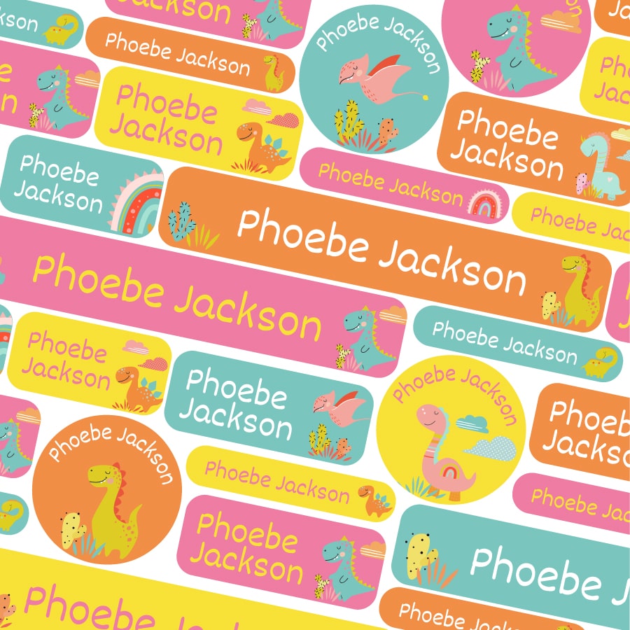
It’s no secret in the office that I absolutely love dinosaurs and animals in general. So whenever the design opportunity arises for these designs I’m always super excited! No surprise then that my favourite new designs are the dino and new savannah packs. We created two dinosaur themed packs this year to compliment our existing pack by Kali Stileman. One pack very much had older children in mind, using more realistic dinosaur artwork and dark green colours. The other was very much thinking about younger pre-schoolers, using bright poppy colours.
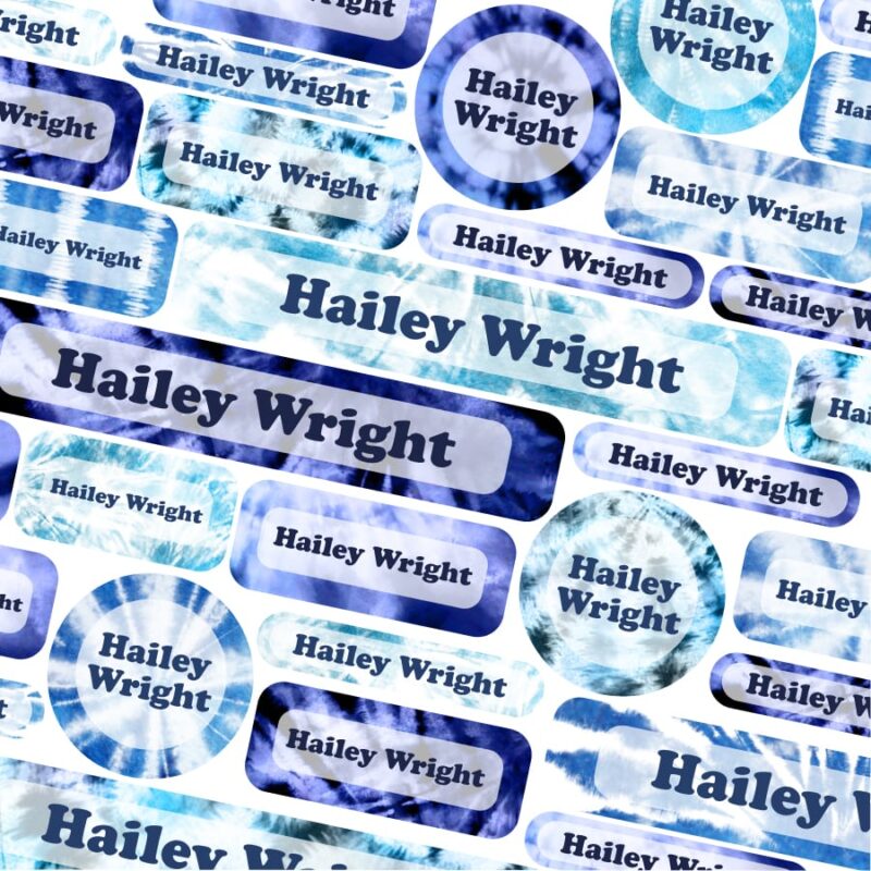
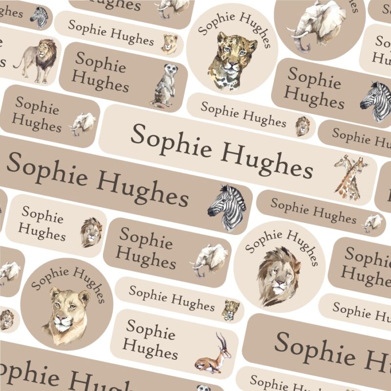
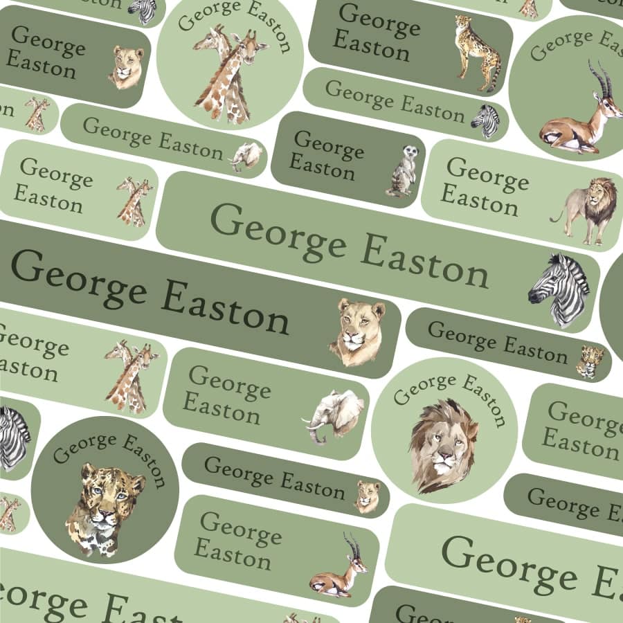
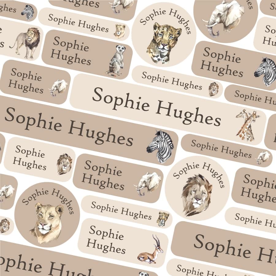
It’s also important to think carefully about a simple font for pre-schoolers who may only just be able to recognise their names.The other pack I loved creating was the Savannah pack. This comes in two colourway options (see below), but both using muted pastel tones and I absolutely love how this pack looks. Perfect for any animal lover!
-

Colourful Dinos name labels
£9.95 – £14.95 Select options This product has multiple variants. The options may be chosen on the product page -
Jurassic Dinosaurs name labels
£9.95 – £14.95 Select options This product has multiple variants. The options may be chosen on the product page -
Savannah (Green) name labels
£9.95 – £14.95 Select options This product has multiple variants. The options may be chosen on the product page -
Savannah (Neutral) name labels
£9.95 – £14.95 Select options This product has multiple variants. The options may be chosen on the product page

Thanks to Georgie for her contribution to this post, and for the new name label packs she’s created. Of course, after this initial creative process, there are then many many hours of hard work to create the final product. This includes creating all the product imagery, copy for the products and then obviously integrating them into our production process (which is very complicated as all the products are personalised!).
We hope this insight has been helpful. Of course, we always love to hear from you about new designs you might like to add to the growing collection. Feel free to comment on this post or drop us a message on our social media pages (use @Stickerscape to find us!).


%20name%20labels&url=https://www.stickerscape.co.uk/product/savannah-green-name-labels/&media=https://www.stickerscape.co.uk/wp-content/uploads/2023/07/001945.01-min.jpg)
%20name%20labels&url=https://www.stickerscape.co.uk/product/savannah-neutral-name-labels/&media=https://www.stickerscape.co.uk/wp-content/uploads/2023/07/001945.02-min.jpg)